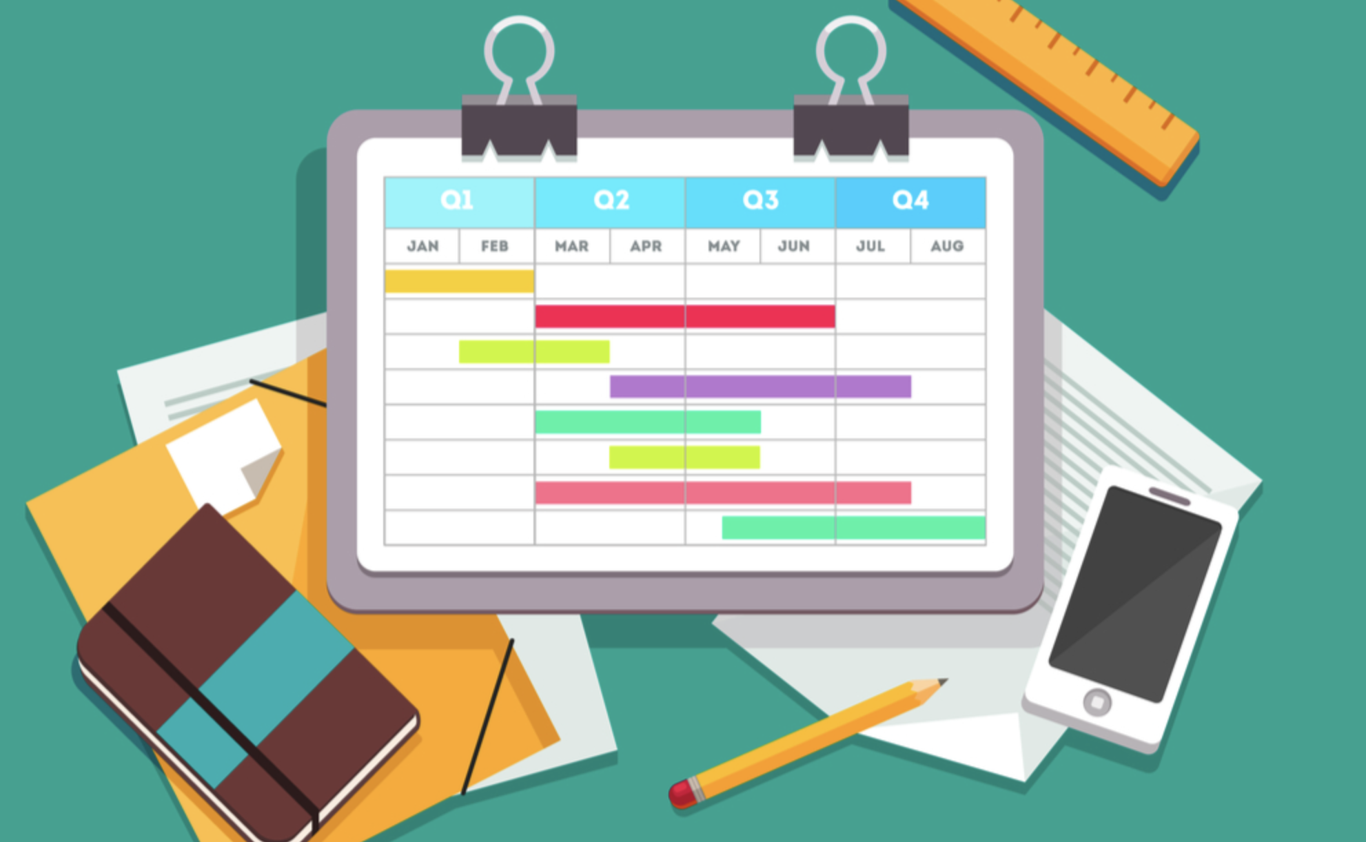
How to Use a Gannt Chart in Notion
Notion has its own version of a Gantt Chart. It’s called the Timeline View, and it can be created from scratch or used as an alternate view for existing databases, and because Notion syncs across devices, it can be viewed at home and on the move.
Below we’ve included an example of the Notion Gantt Chart. This is one we created visualizing a production timeline for a new feature for Notion Wizard. You can assign tasks to individual people, leave comments on the card, and add attachments.
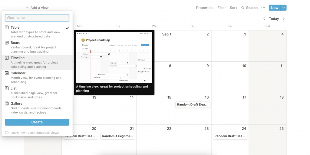
As I said before, you can also turn an existing database or table into a Gannt Chart. To do this, open it, then click Add a View, located beneath the title and choose Timeline. It will reside as a secondary view nestled under the Page in the sidebar.
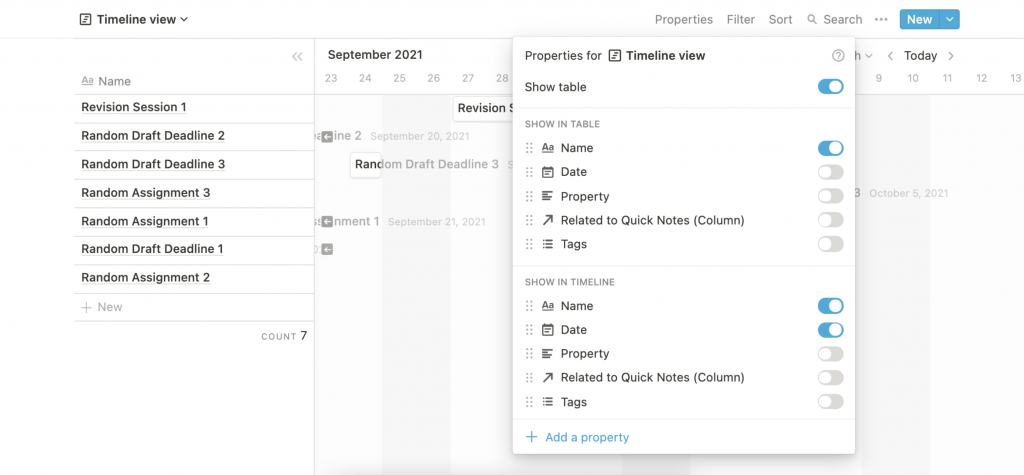
Once created, it will default to showing both the options from the calendar, table or database, as well as the standard Gantt Chart view. By clicking Properties while viewing the Timeline you can add and remove data to your Gantt Chart.
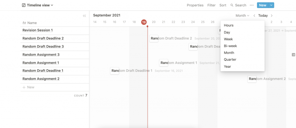
You also have the option to change the timeframe of your Notion Gantt Chart. To boot, it’ll show the Month, but you can switch to Hours, Day, Week, Bi-Week, Quarter or Year by clicking the Month option to choose a different view.
Ultimately, this feature is something you’re going to need to play around with and tweak until it perfectly resembles what you’re trying to illustrate and ties in with your workflow, by choosing the data you want to flow in and how it’s presented.
Notion Gantt Chart Template
To help you get started, we’ve thrown together a quick Notion Gantt Chart template that you can download for free now. We’ve also listed it to our list of the best Notion templates. Just save it to your Workspace and start playing around with it.