Why I Haven’t Built an Aesthetic Notion Dashboard
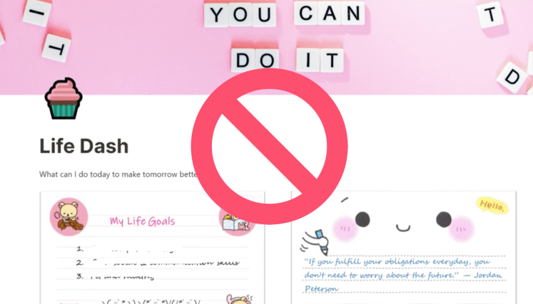
Despite being obsessed with Notion and everything in it, I don’t spend a lot of time tinkering with my Notion dashboard. Other members of the Notion Wizard team swear by having a lean, mean, aesthetically pleasing dashboard, but I don’t buy it. Controversial, I know. But that’s because I live by the mantra: Spend less time saying and more time doing. When talking about Notion, I see altering my dashboard as a form of procrastination, drawing me away from what it is I should be working on. Remember: Function over form, not form over function.
I don’t need fancy buttons or bright colors to take me to my pages. All I need is a traditional link. I don’t need music to play as soon as I open up my Workspace. I have Spotify for that. All Notion is for me is a tool in my chest. I don’t open it up to relax, but rather to improve my workflow, create databases, manage my schedule and store files. No amount of color is going to speed up the amount of time it takes to work on the latest business plan I need to submit to an investor or organize my receipts to submit to the finance team for approval at the end of the month.
That’s not to say I don’t organize my Workspace, because I do. I still have a dashboard. It just isn’t magical — or aesthetic. It has what I need on it and where I need it. It just doesn’t look great. But it does the trick, and that’s all that matters. Of course, not everyone feels the same way as me. Some people need color to help them focus. There’s nothing wrong with that. I for one though am not buying into the aesthetic Notion templates craze that’s sweeping the internet and I’d urge you to consider whether it’s worth your time before you do too.
